Form Properties: Options
All fields, except for the Digital Signature field, have configurable Options on the Properties panel. Each type of field has its own set of options. The various options for the various fields are described below.
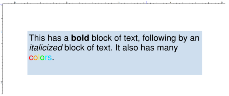
Alignment: Specifies how the text will be rendered inside the Text Box, as illustrated below.

Default Value: Specifies the default text that is shown when the form is reset. When specifying a format for a Text Box, the format and the default value should coincide with each other; otherwise, the default value will be rejected by the format specification.
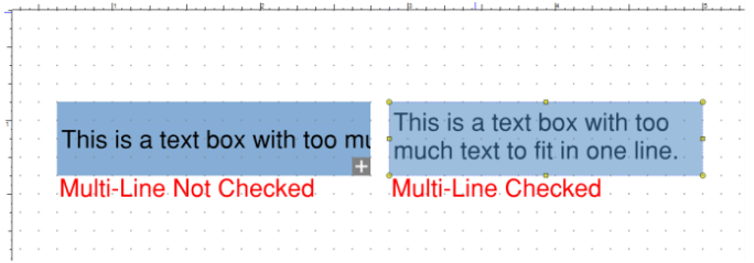
Multi-Line: Enables text wrap inside the Text Box, as illustrated below.

Scroll Long Text: A Text Box may have too much text to be shown within the fixed region of the text box. Setting the Scroll Long Text property enables the rendering of a vertical scroll bar for the Text Box. The Multi-Line property must be set to use this option.
Allow Rich Text Formatting: Enables the use of the same controls that manipulate markups in Revu to modify how text gets rendered inside the Text Box.

Limit of N Characters: Sets a limit on the number of characters that can be entered into a text field.
Password: Sets the Password property that will render the text inside the Text Box as a set of asterisks—much like many web sites do when they require user authentication.
Field is used for file selection: When enabled, Revu reads the text entered in the field as the path name of a file whose contents are to be submitted as the value of the field.
Check Spelling: Enables spell check on text entered in the Text Box.
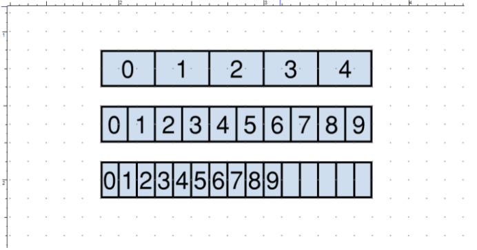
Comb of N Characters: Allows the text box to be broken down into N individual characters. When creating forms to be printed, specifying this property will make it easier for users to manually enter data. It also ensures that no unnecessary data is shown in a form. The example below illustrates N = 5, N = 10, and N = 15 on three text boxes of the same size. All three text boxes contain the same data, but the comb limits how much of that data can be shown.

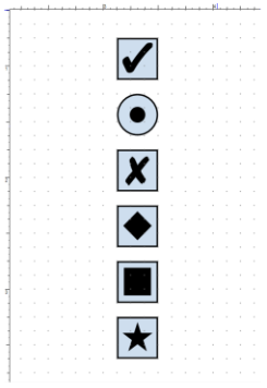
Style: Choose from one of the available styles: Check, Circle, Cross, Diamond, Square, and Star. Examples of these options are shown below.

The Choice property contains the text that is used for the field value in JavaScript. It is shown in the Forms Tab and can be accessed through JavaScript in the following manner:
var radioButtonValue = this.getField("RadioButtonName").value;
Checked by Default: When enabled, the Radio Button is automatically selected when the form is reset. When applying this property to more than one Radio Button, the last Radio Button with this property set is the one that gets selected on a form reset.
Same Name & Choice in Unison: Enables multiple Radio Buttons with the same name to be selected in unison. If any of the Radio Buttons with the same name are selected, all the ones that have this option enabled will go into the same state.
Style: Choose from one of the available styles: Check, Circle, Cross, Diamond, Square, and Star. Examples of these options are shown below.
The Export property contains the text that is used for the field value in JavaScript. It can be accessed through JavaScript in the following manner:
var checkBoxValue = this.getField("CheckBoxName").value;
Checked by Default When enabled, the Check Box is automatically selected when the form is reset.
The Item field allows for adding new Items to the Item List. Enter the desired text in this field and click Add to add it.
The Export Value is used for the value of the selected item(s) in JavaScript. For example, if “ItemA,” is created with an export Value of “ExportA”, in JavaScript the listbox value when accessing the List Box field’s value will be “ExportA”. The following illustrates a single item selected in JavaScript:
// uses the Export Value, not the Item Name
var selectedItemValue = this.getField("ListBox").value;
When accessing multiple selected items, the JavaScript would be:
var selectedItemValues = this.getField("ListBox").value;
for (var index inselectedItemValues) {
// still uses the Export Values
console.println(selectedItemValues[index]);
}
The Item List shows what is listed in the List Box and in what order. See Item to add items to this list. To reorganize an item in the list, select it and use the up and down arrows at the left. To delete an item from the list, select it and click the delete button at the left.
Sort Items: When enabled, the items in the List Box are automatically sorted by their Item value.
Multiple Selection: When enabled, users can select more than one item from a List Box in the PDF.
Commit selected value immediately: Set this property to change the way that selections in a List Box are registered. Normally when this property is not set, the selected value gets committed after the user click or tabs away from the field. However, when this property is set, the moment a user selects a new value, the value will be committed.
The Item field allows for adding new Items to the Item List. Enter the desired text in this field and click Add to add it.
The Export Value is used for the value of the selected item(s) in JavaScript. For example, if “ItemA,” is created with an export Value of “ExportA”, in JavaScript the listbox value when you access the List Box field’s value will be “ExportA”. The following illustrates a single item selected in JavaScript:
// uses the Export Value, not the Item
var selectedItemValue = this.getField("Dropdown").value;
When enabling the entering of custom text into the Dropdown, the value returned is the name of the Item (that is, the text that the user entered).
The Item List shows what is listed in the Dropdown and in what order. See Item to add items to this list. To reorganize an item in the list, select it and use the up and down arrows at the left. To delete an item from the list, select it and click the delete button at the left.
Sort Items: When enabled, the items in the List Box are automatically sorted by their Item value.
Allow user to enter custom text: Enable to make the Dropdown behave as a variation of a Text Box but with default options. A typical scenario would be to use this field which requires an “other” option. An example of this at work is shown below.
Check spelling: Enables spell check on text entered in the Dropdown.
Commit selected value immediately: Set this property to change the way that selections in a Dropdown are registered. Normally when this property is not set, the selected value gets committed after the user click or tabs away from the field. However, when this property is set, the moment a user selects a new value, the value will be committed.
Layout: Determines the layout option used for the Button. Options include:
- Label Only: Using this Style disables the Icon property and shows only the Label text.
- Icon Only: Using this Style enables the Icon property and uses only the Icon to render the button.
- Icon Top, Label Bottom: Choosing this Style uses both the Icon and Label text to render the button. The Icon is placed above the Label.
- Label Top, Icon Bottom: Choosing this Style uses both the Icon and Label text to render the button. The Icon is placed below the Label.
- Icon Left, Label Right: This Style uses both the Icon and Label text to render the button. The Icon is placed to the left of the Label.
- Label Left, Icon Right: This Style will use both the Icon and Label text to render the button. The Icon is placed to the right of the Label.
- Label Over Icon: This Style will use both the Icon and Label text to render the button. The Icon is placed first, and then the Label is placed on top of the Icon.
Behavior: Determines how the button will be rendered the user clicks it. Options include:
- None: When the user clicks on the button, no visual change will be indicated in the PDF.
- Push: When the user clicks on the button, the beveled edge will be inverted. Setting the Behavior to Push also enables additional states for the button, specifically: Up, Down, and Rollover.
- Outline: When the user clicks on the button, the outline on the button will disappear, and the remaining edge of the button becomes darker.
- Invert: When the user clicks on the button, the button renders as an inverted image.
State: Ties the Label and Icon together. Options include:
- Up: Describes the state when the button is “Up”, or the time before a button is pressed.
- Down: Refers to the state when the button is “Down” or the state as the button is being pressed.
- Rollover: Refers to the state when the user’s mouse hovers or rolls over the button.
Label: Sets the text shown on the button.
Icon: Sets an icon to be used with the button. Click Select to choose the icon to be used for the specific state. Click Clear to remove the reference to the icon from the PDF.
% Bottom: Specifies a number between 0.0 and 1.0 (0 – 100%) that will move the icon vertically inside the button.
% Left: Specifies a number between 0.0 and 1.0 (0 – 100%) that will move the icon horizontally inside the button.
When To: Specifies when to apply a scale factor. There are four options: 1) Always, 2) Never, 3) Icon is Too Big, and 4) Icon is Too Small.
Scale: Specifies how to render the icon in the button. Setting the property to proportionalkeeps the aspect ratio of the original icon consistent. Setting the property to Anamorphic stretches the icon to fit the button.
Disregard Borders: When using Icons, there is a small padding from the edge of the button to the icon being rendered. Setting this property will remove that padding.